
Cuesa
A focus app that gives people structure without the pressure.
- Timeline
- 8+ weeks
- Stack
- SwiftUI, SwiftData.
- Scope
- iOS app design and development. Solo project, currently in App Review.
“The check-in takes two seconds, and after a few days Insights showed me I do my best work before noon. I didn't know that.”
About the project
Choose a cue, focus, reflect.
Productivity apps run on streaks and overdue warnings. Research showed the real problem was friction and unfinished work piling up, not guilt. So Cuesa cuts the pressure tricks: unfinished cues roll over quietly and a two-second check-in replaces scores.
Cuesa shows founders my whole process, from research to App Review, on a product of my own. After launch it becomes a paid product.
The challenge
I assumed streaks make people feel guilty.
Research with designers, developers, product managers and data people said otherwise: only 1 felt guilty or anxious, 7 felt focused, 6 felt neutral and 3 didn't answer. The real pain was friction, and unfinished work piling up.
“Google Task isn't flexible enough, Notion is too complex, takes away my productive time.”
Structure without pressure
People wanted planning to feel light and forgiving.
Reflection people will actually do
9 of 17 wanted gentle insight into how they work, but only 6 rated themselves a 4 or 5 out of 5 on how often they reflect. Logging could not become another to-do.
Trust with personal data
The app asks people to record how they feel while they work. That data had to stay theirs.
Research
The real pain was friction, not guilt.
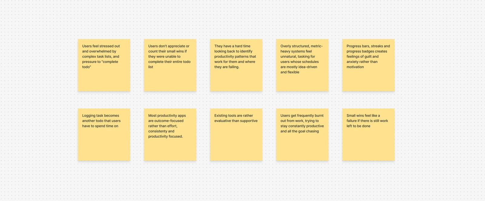
Before any design work, I wrote down ten assumptions and tested each one against the research.
Progress bars, streaks and progress badges create feelings of guilt and anxiety rather than motivation
Mostly wrong
1 of 17 felt guilty or anxious. 2 said they work better under pressure.
Overly structured, metric-heavy systems feel unnatural for people whose schedules are mostly idea-driven and flexible
Held
“Google Task isn't flexible enough, Notion is too complex, takes away my productive time.”
People feel stressed and overwhelmed by complex task lists and the pressure to “complete the to-do”
Held
“The things to do pile up.” People wanted to continue or reschedule without a penalty.
People find it hard to look back and spot the productivity patterns that work for them
Mostly held
9 said yes, definitely. 6 said maybe. 2 said no.
People were also patching tools together. One designer wrote, “I use a Pomodoro timer and phone focus mode.” It was a small sample, so the results set the direction rather than proving it.
Product design
Three calls that shaped the product.
No streaks, no “overdue”
I cut streaks, achievement badges, gamification and red overdue warnings, because streaks make the pile-up of unfinished work feel worse. The research didn't make this an easy call: one developer liked their habit tracker because “it's encouraging,” and two people said they work better under pressure.
The replacement came from a product manager who asked for “an avenue to specify if task was completed or you need to continue afterwards or reschedule.” An unfinished cue is never “Missed.” You choose to Continue it or Release it, and unfinished cues roll over to tomorrow quietly. An empty day shows a friendlier screen instead of a warning, and deleting a cue can be undone.
A check-in, not a score
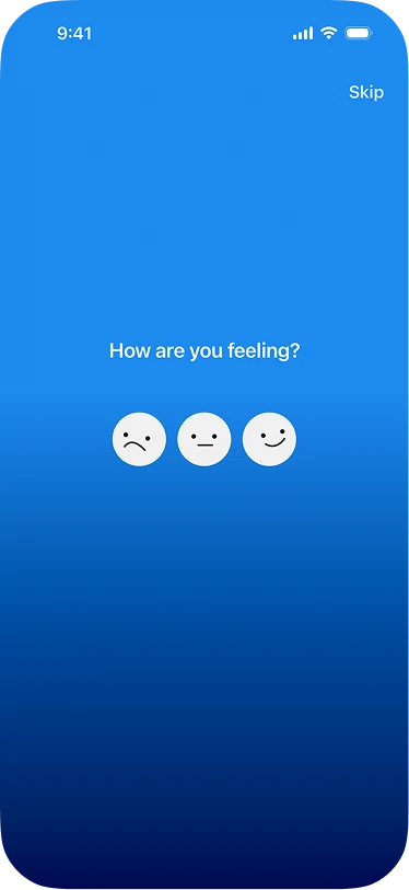
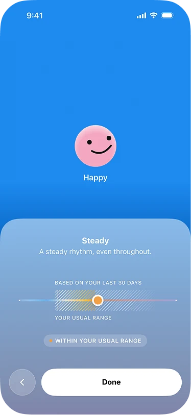
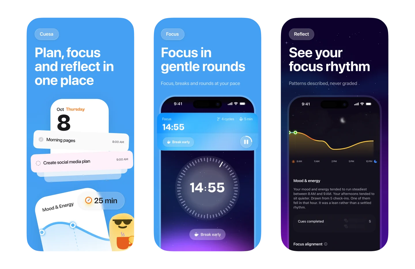
When a session ends, Cuesa asks for mood with one tap and energy on a slider. That's the only input the app learns from.
Mood and energy patterns unlock after a few days of check-ins, and the screen explains why it's waiting. One data scientist asked for a scorecard. Insights use plain observations instead, like “You complete more cues before noon,” because a score would bring back the pressure most respondents wanted gone.
Fewer interruptions
People can start without signing up, and their mood and energy stay on the iPhone. Reminders are silent and the session moves to the Lock Screen as a Live Activity, because people asked for fewer interruptions. Respondents asked for calming sound, which became the ambient audio in the first beta.
iOS build
Designed and built natively in SwiftUI.
Knowing what each choice would cost to build made it easier to cut and commit, with no hand-off between designer and developer.
The first TestFlight beta on September 27 included cues, focus sessions, reminders, ambient audio, check-ins and Insights. Cuesa is in review.
Measuring it
What I'll measure after launch.
The research is a baseline that doesn't need tracking. Testers will get the same question again, “How does Cuesa make you feel?”, to compare against the first round: 7 focused, 6 neutral and 1 guilty.
| Decision | Signal | Source |
|---|---|---|
| No pressure mechanics | People come back without a streak pulling them | App Store Connect retention, from users who opt in |
| Check-in | Insights tell testers something they didn't already know | The same research question sent to testers, plus their feedback |
The biggest open question is whether people stay long enough for their patterns to unlock. Features respondents asked for that were deferred, like batching notifications until a break, are on the roadmap.