Niora
Brand identity and product design for a wellness app connecting fasting, nutrition, and activity.
- Year
- 2026
- Role
- Founding Designer
- Timeline
- Ongoing
- Scope
- Brand Identity, Product Design, UI/UX, Illustration
The platform needed a brand identity from scratch and a product experience that makes tracking across all three areas feel cohesive, not like three different apps stitched together.
Approach
I designed the full brand system and the core product experience across fasting and nutrition features.
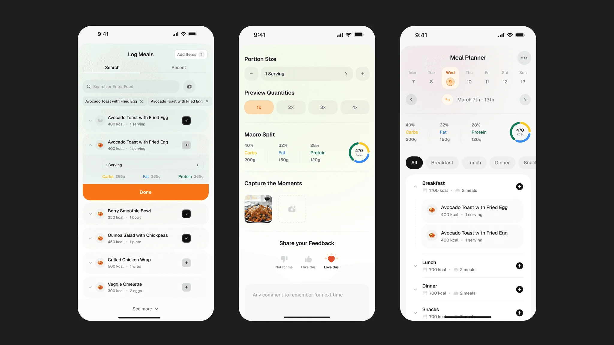
Unify the experience, not just the features — Most wellness apps treat fasting, nutrition, and fitness as separate tools. I designed a single design language across all features so users moving between them never feel a seam: same components, same layout patterns, same illustration system.
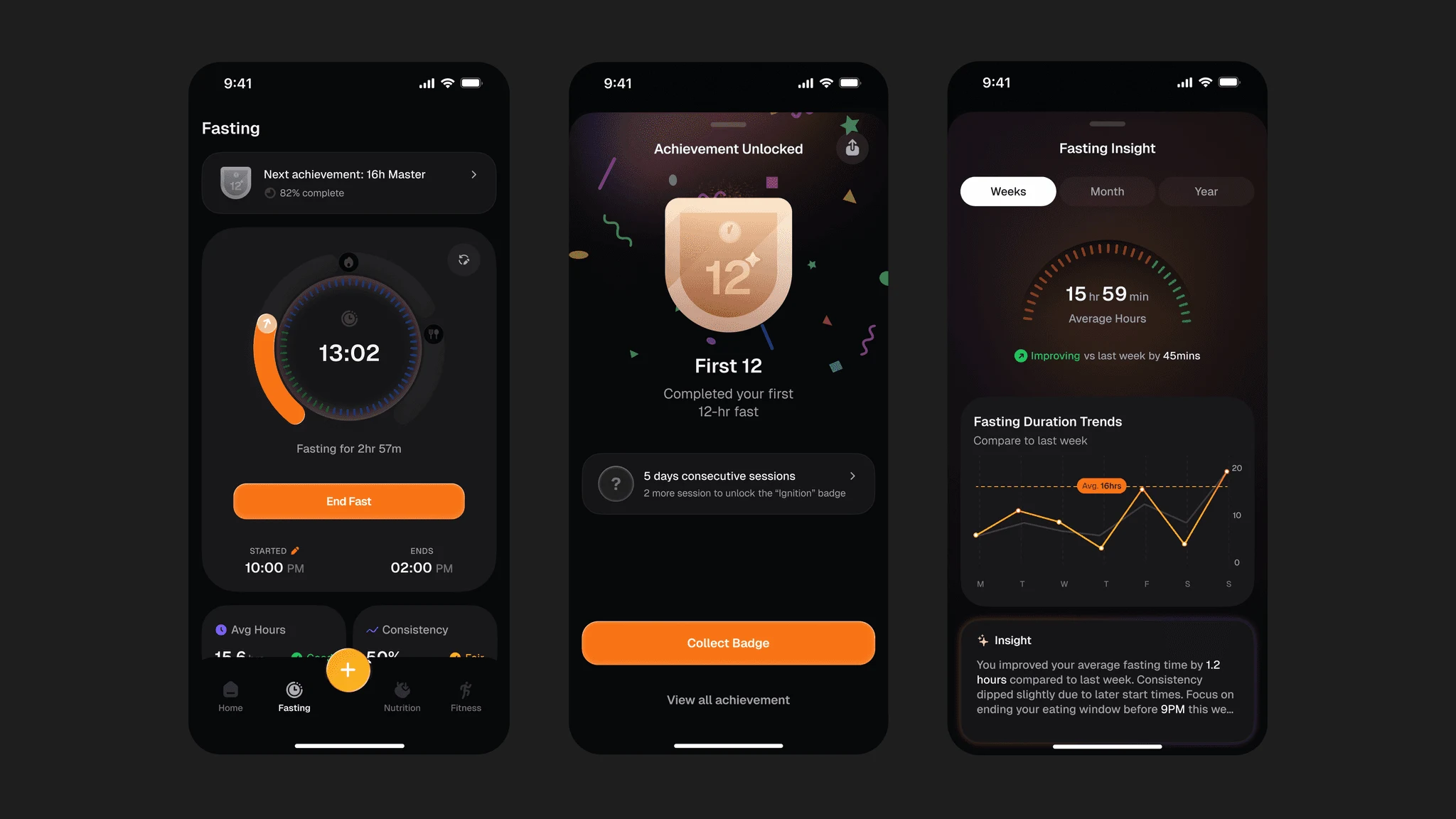
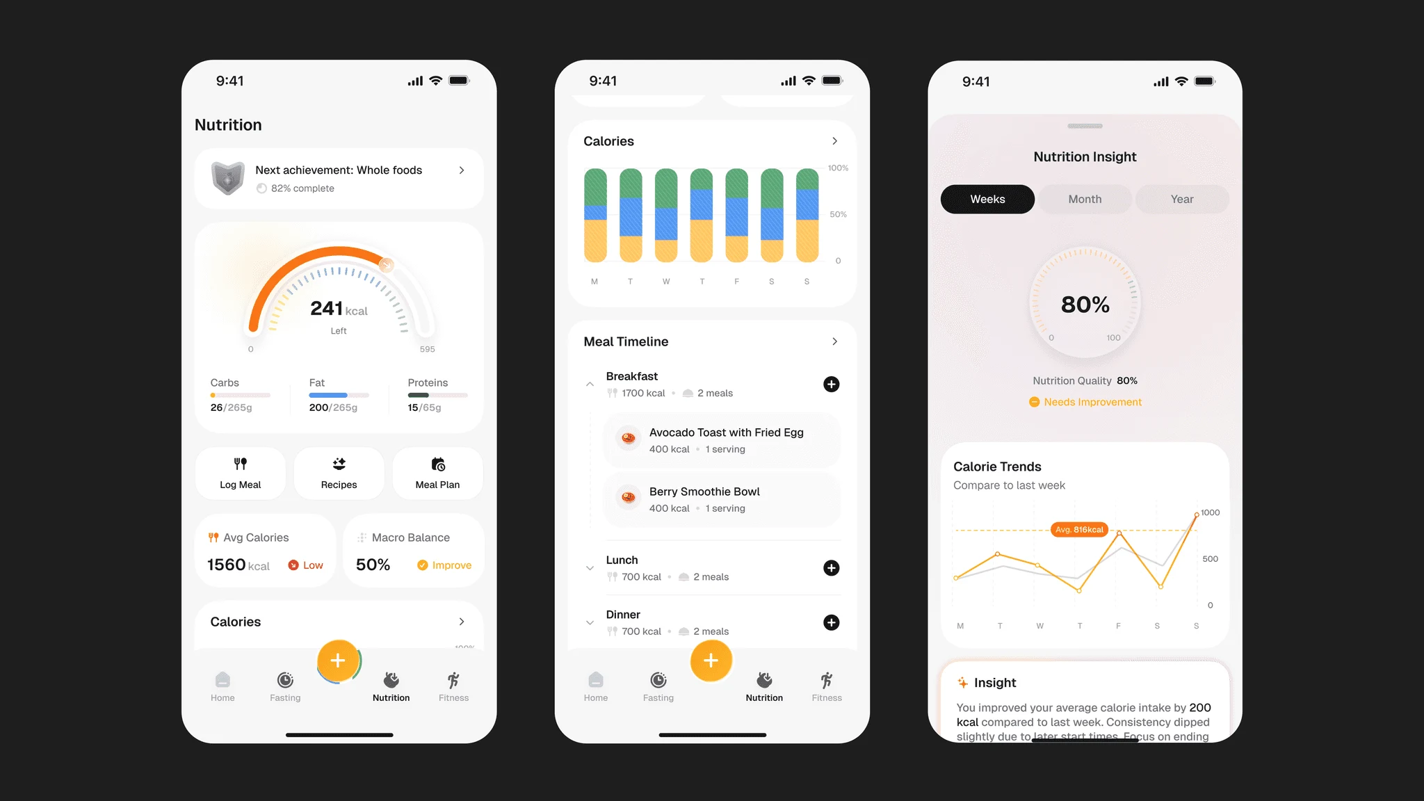
Make tracking feel like progress, not data entry — Instead of presenting logging as forms and fields, I structured each feature around momentum: circular timers, trend charts, streaks, and insight summaries that tell users what their data means before showing them the numbers.
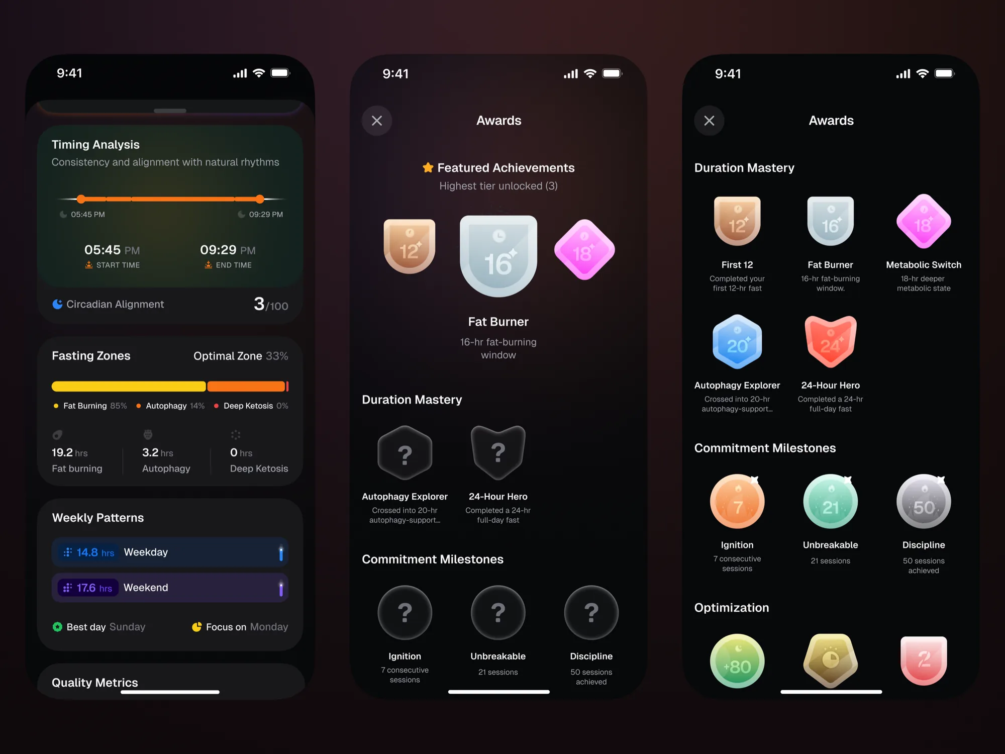
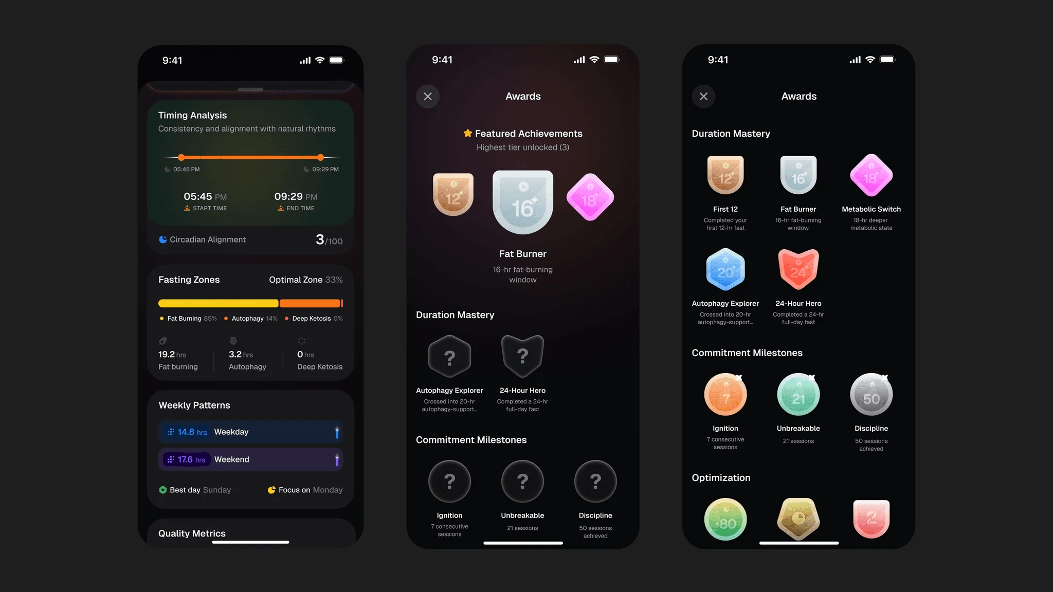
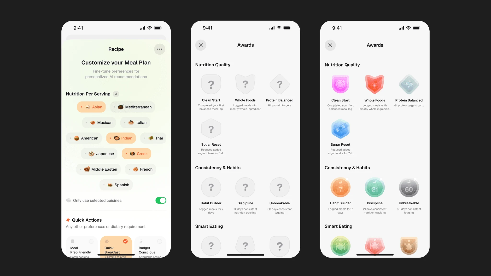
Build in emotional reward — Wellness apps lose users when the only feedback loop is guilt. I designed a milestone and achievement system with custom illustrations that acknowledge consistency and behavior, giving users something to earn, not just something to log.
Solutions
Key decisions
One design language, not three — Fasting and Nutrition share the same component system, layout patterns, and illustration style. A user moving between features should never feel a seam. This was a deliberate structural choice, not a shortcut.
Insight screens lead with meaning, not data — Instead of opening with raw charts, insight screens lead with an LLM summary that tells users what their data means in plain language. Metrics and charts reinforce the summary rather than competing with it.
Achievements as a retention system — The badge and milestone illustrations aren't decorative, they're designed as a behavioral framework that scales across all three features. Categories, shapes, and colors are systematic enough to extend to Activity without starting over.